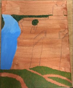
 At this point I had done the wash layer on my canvas, and started to paint the river, the trees, and the grass. 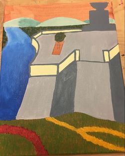 I painted all the gray stone, the statue, the mountains, the flowers, and added more value to the river. 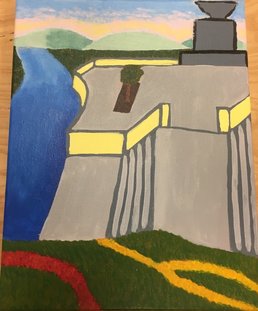 I added the steps, worked on the tree in the middle, and started to work on the sky. 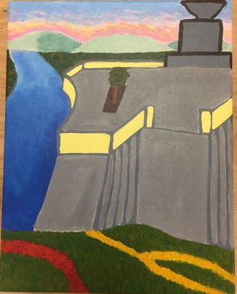 This is the final piece. I darkened the sky and the stone, and fixed the outline on the statue. 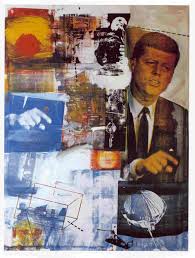 This is one of Robert Rauschenberg's paintings. Retroactive I Self Evaluation
1. Who was your referenced artist for the painting? Name 4 main ideas you used from your research to create your painting. Robert Rauschenberg 1. I used his collage style by pulling in pieces from multiple pictures when creating my landscape. 2. I tried to use some spontaneous brush strokes that looked thrown in like he did with his own style for areas like the steps. 3. Pop Art involves demonstrating that everything is connected, so I tried to make the pieces from the different pictures appear connected. 4. His monochrome paintings started off in black, white, gold, and red, so I tried to make sure that these colors were used throughout my piece (even though it wasn't monochrome). 2. Describe the craftsmanship of your painting. (Is it neat and well executed?) Certain parts of my painting have better craftsmanship, while certain parts look a little sloppy to me. I think that the river and the sky show good craftsmanship because of all the different colors and values that are scattered throughout them. The statue and the stone aren't quite as good, but I think that they are still pretty good. 3. What was the most difficult part of this project? The most difficult part was trying to proportion everything when I was sketching it onto the canvas. Once I actually started painting the picture it wasn't too bad, but trying to make everything fit on the canvas nicely when they don't all come from the same picture was a little difficult. It took a lot of erasing, but in the end I think I got things proportioned pretty well. 4. Describe your color choices and how they reflect the work of your chosen artist. He used lots of primary colors in his work, and I have lots of primary colors in my piece with the river and the flowers. He also uses black and white, and some values in between, which can be seen with the stone and the statue in my piece. 5. Describe how the style of your landscape reflects your chosen artist. The style of my landscape reflects his work because I took pieces of landscapes from a bunch of different pictures to try to emulate his collage style. It isn't quite as obvious in my piece that it isn't an actual landscape, but I used pieces from almost all of my reference pictures in the final piece. 6. What do you think your chosen artist would say if he or she could see your painting today? I think he would suggest using mediums other than just paint to add to my piece. There is nothing sticking out from the painting, which is something he commonly did. He might also suggest making the painting more sectioned off for the pieces that are from different pictures, and to make each section be one color (he tended to do this in his collage style). Basically, I think he would make suggestions to me to make my painting more like his style. 7. What would you do differently if you were to do this project again? I would try to make it more obvious that it isn't supposed to be an actual landscape. It would look more like his style if it had the collage look to it a little more. Also I would try to make the steps look a little more like steps, and maybe make the whole stone area smaller so that it doesn't take up as much of the canvas.
0 Comments
 Here are the gummy bears and the box after I had finished sculpting them. 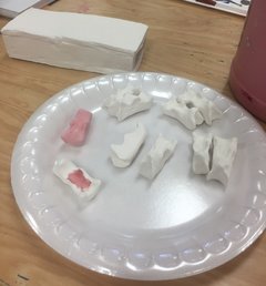 This is what they looked like after going through the kiln. I started putting glaze on a couple of the gummy bears at this point. 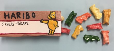 This is the final piece after glazing all of the gummy bears and using acrylic paint on the box. Self Evaluation
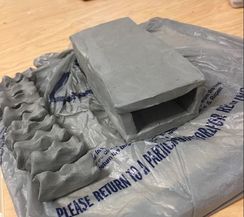
1. Describe the craftsmanship of your sculpture. (Is it neat and well executed?) The gummy bears show good craftsmanship, and I think they turned out good. The box is a little less neat and well executed, but I still think that it looks pretty good. Overall, I would say my piece shows some pretty good craftsmanship, but it isn't perfect. 2. What was the most difficult part of this project? The most difficult part of this project was definitely trying to make a clay box. Getting the clay pieces in proportion before putting them together was hard, and then trying to score and slip the pieces together changed the shape of it some. From there I had to try to smooth it out into the closest box shape I could get. The whole process of creating the box was by far the most tedious and difficult thing I had to do for this project. 3. Did your color choices work together harmoniously? The colors worked together harmoniously, and I copied the colors of actual gummy bears as closely as I could with the glazes. The colors look good together for the actual food, so they looked nice for my sculptures. The brown on the box was the hardest color to make, but all of the colors on the box work nicely with the colors of the gummy bears. 4. Is your sculpture interesting from all views? The gummy bears are interesting to look at from all angles, and I tried to show this by having them in different directions and on different sides in my final picture. The box is only interesting looking at it from above or looking at it from the front where gummy bears can be put inside. The only side of the box that isn't just brown is the top, so that makes it the most interesting side to look at by far. 5. Describe the differences in constructing a sculpture and doing something 2D. When making a sculpture you have to keep in mind what every angle of the piece will look like. With 2D, you don't have to worry about every single side of what you're making since you can't see all of it. Also, entirely different materials are used to make 3D objects and 3D objects have a higher potential of being held by someone who is looking at a piece. 6. How did you create textures in your sculpture? Gummy bears have a smooth, glossy texture, so the glaze was very helpful to show that texture. The different types of paint that I used helped to show the different textures between the gummy bears and the box. The acrylic paint makes the box look stiffer than the gummy bears, and makes it look more realistic. 7. Does your sculpture look like the actual food? How did you accomplish this? The gummy bears look like the real thing for the most part. They are bigger than average gummy bears, but that isn't as noticeable. I couldn't make them kind of see through with the paint, so I used the glaze to give them shines and highlights that could elude to them being like normal gummy bears. The glaze was very helpful in making the gummy bears look more realistic. 8. What would you do differently if you were to do this project again? I would paint more layers of glaze on some of the gummy bears, because some of it didn't cover quite as well as I thought it would. I would also try to find a different way to do the box that would make it fit together a little better. Lastly, I would try to find a smaller brush or something else to use to do the detailing and outline on the bear and to write on the top of the box. 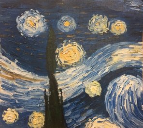 This is the part of Starry Night that I was given to paint. 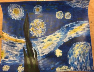 Here is my version done with acrylic paint instead of oil paint. It was hard to get all of the shading and texture with the acrylic paint, but I am happy with the results.
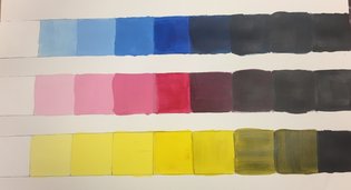 I did value charts for the three primary colors, and I like the way that the tints turned out much better than the shades. The shades are harder to differentiate between for the red and the blue, while the tints are harder to differentiate between for the yellow. 
 Here is a list of all of my ideas along with some practice sketches on different colored paper. I ended up deciding I liked the pink best. 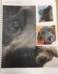 These are all of my reference photos for my drawing.  The first day of working on the final drawing I wanted to just focus on the eye. I wanted to make sure I got all of the highlights and value changes as well as the reflections in her eye. 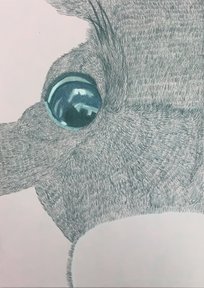 I was only concerned with adding the dark gray color as a base layer first. I wanted to do all the fur like this first, and then go back and add blues and purples to show changes in value. 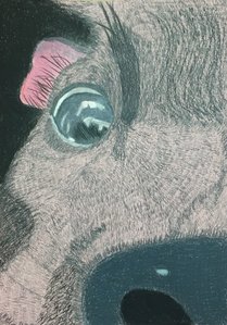 I worked on the ear and the nose a lot, and finished adding all of the gray to the page. The highlights were added for the nose and the ear. 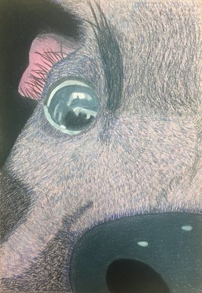 Lastly I added some blue and violet shades to get value changes. I wanted there to be more blue in the piece than violet. I left a little bit of the pink paper showing through just to add a little more color to the piece. SELF EVALUATION
1. Describe the craftsmanship of your drawing. (Is it neat and well executed?) I think that I did a good job of keeping my piece neat and drawing the fur carefully. It was time consuming to draw all the individual hairs, but it was worth it to make the piece look like it had more texture. Also all of the layering on the eye took a long time, and I think it turned out really good in the end. 2. Do you think you used a full range of values to create the illusion of depth? My range of values in the fur help to show how close or far away different parts of her face are. The nose and the eye don't have much depth to them, but the ear and the rest of the fur have a lot of value changes throughout. 3. How do you think you represented the style of the artist Georgia O'Keeffe? I represented her style because the picture is very up close, but the subject of my piece is different from what she typically created. She typically did flowers and landscapes up close, while I decided to do a dog, but the upclose style is still the same. 4. Describe your choice of colors/color harmonies and how you used them throughout the artwork. The reference picture that I used was very dark with lots of black and gray. To add more color to my piece I used a colored paper and added some blue and purple to the piece. The blue, pink, and purple all go very well with the original color scheme of the dog and the three colors can be seen throughout my piece. 5. How did you create contrast in your drawing? Using different shades of blue and violet to create different values in the fur created contrast in my drawing. Also the different textures between the fur, nose, and eye showed a different contrast in texture. 6. How did you use textures, highlights, and shadows to enhance your artwork? Texture was a very important part of this piece because without it the fur wouldn't look nearly as realistic as it does. One place where I really utilized highlights and shadows was the eye. There was a reflection of part of a room within the eye, and through highlights and shadows I was able to show the change in value within that reflection. 7.Describe any difficulties you had creating your drawing and what you could do to improve your drawing? I had some difficulty with figuring out how much blue to add and what shade to put where. I also struggled some with changing the direction of the fur in different areas of the face. Part of my reference photo was a little blurry, so I couldn't tell exactly what way the fur was going. To improve I could have found a higher quality picture of that part of her face just to look at the fur in that specific area. 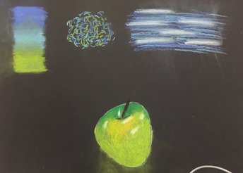 This paper shows gradient and other pastel techniques along with an apple (I think this apple turned out better than the one shown last). 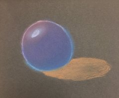 Pastel colored sphere. At first the colors I used were very blocked out, but I think by the end I did a good job of blending them together. 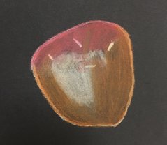 Here is my second apple. I like the first one I did better than this one, and I would probably go back and blend this a little bit more just so the colors aren't as blocked out.
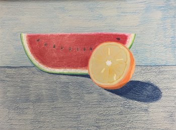 I decided to draw an orange and a watermelon. I had to use the white for blending a lot on both, and I like how the orange turned out better than how the watermelon turned out.
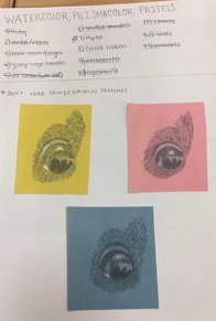
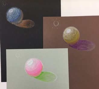 Here are my three spheres on different colored paper with different colored pencils on each. The blue sphere was the first one I did, then the yellow, and lastly the pink.
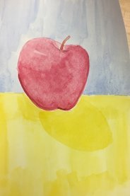 This apple is done with all cool colors, and I tried using salt on the apple to change the texture some. The salt didn't really do anything though, and it shows up even less in the picture than it does in person. 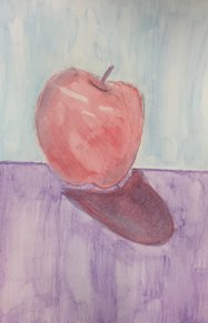 This apple was done all with water color pencils. I used a white crayon to make sure that the highlights would still be there when I went over it with water. 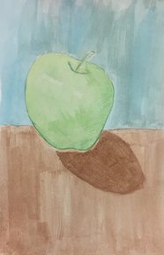 This apple is normal watercolor with prismacolors over it to add shading. 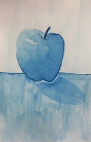 This apple is monochromatic. You can't really see it because it is so light, but I did paint the background behind the apple.
|
AuthorThis blog has my work for every art class I have ever taken in high school. You can find my work from Art 2 and Computer Art actually on here, but my work from Art 1 and Sculpture is on a link to a separate page. Archives
May 2017
Categories |
 RSS Feed
