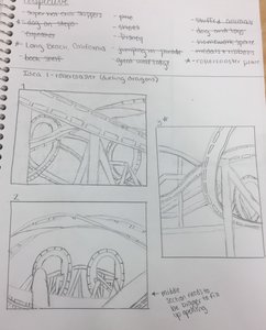
 Here is a list of all my potential ideas with my three composition sketches for the roller coaster idea. 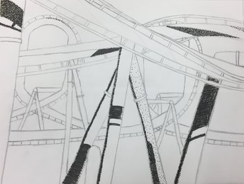 This is my final sketch in my sketchbook with some practice shading to see which techniques I wanted to use. 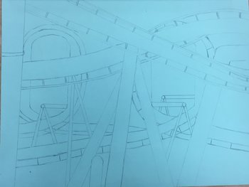 Here is the beginning of the final once I had finished sketching out the roller coaster. *I'm not sure why the paper looks blue here and almost gray in the other pictures, but the paper I used is a minty green color. 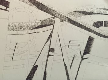 I had finished shading the shadows on the poles, and began stippling the two crossing tracks in the front. 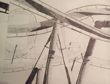 I was almost done stippling all of the tracks at this point, and I had started to stipple the poles holding up the tracks. 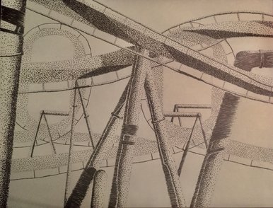 This is the final piece with the tracks and poles stippled and the shadows hatched. SELF EVALUATION
1. Discuss your decision on pen and ink techniques. Why you chose to use one or more. I knew I wanted to use stippling for at least part of my piece because I really liked the way that stippled pieces turned out. I also liked how hatching looked, and I thought using it for the shadows could be helpful to differentiate between shadow and track. I didn't like the way cross hatching turned out in my final sketch, so I didn't want to use it in the final. I couldn't think of any invented I wanted to use either. 2. How did you use perspective? Why is perspective important? I used perspective to show depth in my piece with some tracks being closer and some farther away. Perspective is important because it can make things more realistic for the viewer and it helps give an idea of how far away different things are from each other within the piece. 3. How is texture important in your composition? Texture is important because both the poles and the tracks need to look smooth, which made stippling good to use. Stippling also made it easy to show corners of the tracks and make them flow. 4. Why is value so important in this project? Value is so important because it changes so much as the tracks curve around each other, and the shadows on the poles add different values. Value is also needed to show that the poles are cylinder shaped and it makes them not look as flat. Without value this whole piece would look much more flat and monotone. 5. Describe your craftsmanship (How well the project is crafted technically). I think I did a good job with the stippling and hatching on the different parts of the track. I also think I did a good job making everything proportional when I was drawing. The loops were the hardest part for me to draw because I drew them last and had to keep their circular shape behind the other tracks and poles. 6. If you could recreate your piece what would you do differently to enhance your final outcome? One thing I would do differently if I had more time would be to use a smaller pen for all of it to make the stippling even more detailed than it is. I would also add some more scenery to the empty space surrounding the roller coaster. 7. -Didn't do fairytale- 8. When applying the pen and ink techniques why and how is it important to make sure you understand the concepts taught in class? Understanding the idea of value and shading in combination with the different types on techniques is very important because they make your piece more realistic. Without them the piece would look flat and boring, but with them it pops off the page more. 9. As a growing artist how do you think what you have learned will guide and better your future projects. Even from just doing two projects, what I have learned so far is building on itself. For the first project I really started understanding value and shading with a pencil, which made switching over to pen easier. I think that as the semester continues, the things I learn in one project will be helpful for the next so my projects will continue to get better as the semester continues.
0 Comments
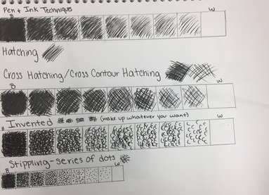 Before trying to shade any shapes we made value charts for all of the different techniques. Hatching is doing lines in one direction to fill the shape. Cross hatching is doing lines that cross each other to shade. Invented can be whatever shape you want. Stippling is using single dots. 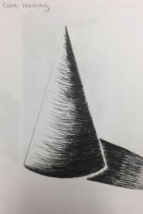 I decided to use hatching to shade the cone. I chose hatching because I thought it would make it easier to show the curve of the shape. 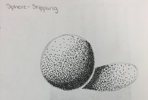 I used stippling for the sphere. I had seen stippled spheres before and I really like how they look, so I wanted to try it. 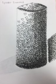 I chose invented for the cylinder. I think if you have a reason to need invented for shading it could be good, but for this invented was my least favorite technique. 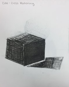 I used cross hatching for the cube. I thought doing crossing lines would go nicely with the shape of the cube, and I think it creates a nice look for this type of shape.
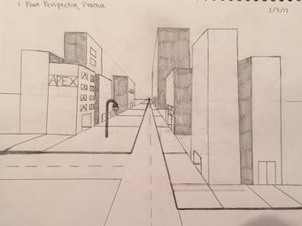 1 Point Perspective This drawing was done in 1 point perspective. I had learned 1 point perspective before, but it has been a couple years since I have had to do it, so I didn't totally remember how it worked. I tried adding more buildings as well as doors and windows for the already existing buildings. I also added an additional road to the sketch. 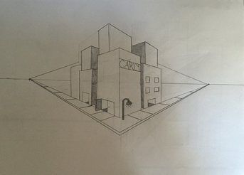 2 Point Perspective This drawing was done in 2 point perspective, which I may have done before but I can't remember. Since this was new to me I was more focused on trying to add buildings and layer them over adding detail. I attempted writing on one of the buildings, and some of the letters in my name are difficult for me to write in perspective. 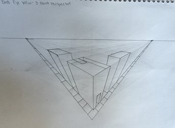 3 Point Perspective This perspective was definitely the most difficult for me to understand, which is why I only added three buildings to it because even adding those was getting confusing for me. The sidewalk was easy for me to understand but looking at all the lines to create one building was messing with my head some. 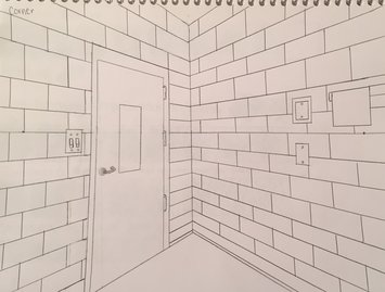 Room Corner
I think I got a pretty good grasp on how to do a corner of a room using two point. I tried to anything that was actually attached to the walls, but when it came to doing chairs or computers that were also in this corner I didn't totally understand how to do them. I wanted to add in the bricks instead to make sure I understood how to add them. 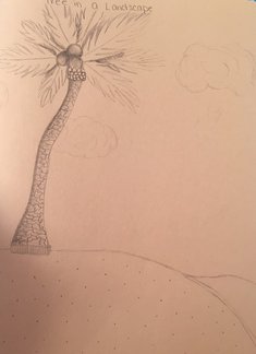 Tree in a Landscape I didn't want to do the typical tree that you see everywhere in North Carolina, and a palm tree was the first thing that came to mind. I wanted the tree to be on an island, so to fill the rest of the page I added a couple of clouds and tried to show water hitting the shore. One thing I would work on if I was going to draw the tree again would be shading the leaves. 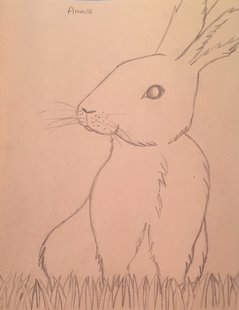 Animal I'm not totally sure why I chose to do a bunny, but when I saw that we had to draw an animal a rabbit was the first thing that came to mind. I tried to add texture by showing the fur whenever the lines had a direction change, and also the whiskers show a type of texture. I want to learn how to really show texture when drawing animals. 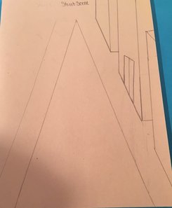 Street Scene This drawing was the one I was the least prepared for, which is part of the reason it isn't finished. We started learning one point perspective before I finished, and since this is supposed to be a pretest of sorts to see what we know I thought I would leave it unfinished how I had it. I know how to draw a street scene in 1 point perspective now, and it looks pretty different from what I drew here. 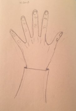 Hand
Hands are something I have struggled with drawing for a while. I think I did a pretty good job with proportions, comparing this hand to my own, but I want to get better at making it look more normal and getting all of the little details right in the future. 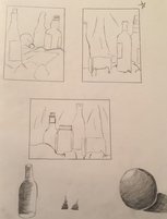 This picture shows all three of my compositions, and the star is next to the composition that I ended up using for the final piece. 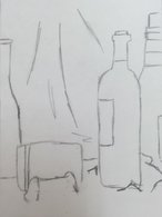 This is a zoomed in picture of the composition that I used for the final piece. 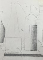 Here I drew my composition on the bigger piece of paper, and I began to try to shade the bottles. 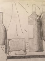 At this point I had mostly finished shading the bottles, and I was getting ready to move on to shading the blanket. 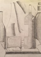 I added a little more shading to the bottles, and began working on trying to shade the part of the blanket that is behind the bottles. 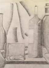 This is the finished piece after I was done shading the blanket, and all of the bottles. SELF EVALUATION 1. Describe how you arranged your composition. Discuss the use of elements and principles. Is it a successful composition? When I first looked at the bottles through my viewfinder this area was the first one to stand out for me for my composition. I liked the varying heights and shapes of the bottles, and I didn't have to worry too much about the blanket. I used the elements of line, form, value, space, and a little bit of texture throughout my piece. Line and form can be seen defining the shape of the bottles and the blanket. Value, space, and texture made everything appear more 3D, and helped enhance my piece. I used the principles of proportion, gradation, variety, and movement. These can be seen through the variety of bottles that I used in my piece, and in the way I shaded everything. I believe that my composition was successful. 2. Did you use a wide range of values? (A range from white to black with at least 9 values). Explain how this is evident. I think I did get a good range of values from black to white throughout my piece, but I don't think it had at least 9 values throughout. My transitions in value weren't always totally smooth, and I think the blanket is a good place where you can see how I need to improve my value transitions. The bottles, for the most part, went pretty well when I was transitioning in value. 3. Explain how your knowledge and creating practice studies with value contributed to your piece. I didn't have a ton of knowledge about value before this class because in the other art classes I did I didn't do a ton of drawings, and the drawings I did I typically didn't try to shade. Drawing the sphere and the practice bottle as well as just practicing a little bit of shading on little parts of the final piece helped me to understand it better for my final piece. 4. Describe the blending and transitions in your objects (discuss your use of pressure with pencil and other techniques to achieve this). For the bottles I would lightly shade the entire thing and then erase to add highlights and shade darker to create value changes where they were needed. I didn't want to do the same thing for the blanket partially because I didn't want it to blend in with the bottles, but also because I thought the blanket should have a lot more white space than the bottles do. For the blanket behind the bottles I tried to draw lines going in the right direction, and going from light to dark, to show the shadows from the light. 5. Explain how your interpretation of texture is essential in capturing the look of the object. How you interpret the texture of an object can impact the way you shade it and how you draw it. Two people could be drawing the exact same thing, and, if they interpret the texture differently, the drawings could come out totally different. The way someone uses texture could have a big impact on the final piece. 6. If you could recreate your piece what would you do differently to enhance the final outcome? I would try to shade the blanket differently behind the bottles because I'm not totally happy with the way that part turned out. Also I would try to really get 9 values into my shading because I feel like my shading jumped from lighter values to darker values pretty quickly. |
AuthorThis blog has my work for every art class I have ever taken in high school. You can find my work from Art 2 and Computer Art actually on here, but my work from Art 1 and Sculpture is on a link to a separate page. Archives
May 2017
Categories |
 RSS Feed
