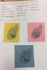
 Here is a list of all of my ideas along with some practice sketches on different colored paper. I ended up deciding I liked the pink best. 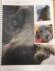 These are all of my reference photos for my drawing. 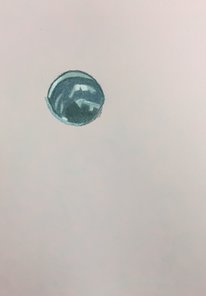 The first day of working on the final drawing I wanted to just focus on the eye. I wanted to make sure I got all of the highlights and value changes as well as the reflections in her eye. 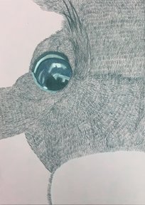 I was only concerned with adding the dark gray color as a base layer first. I wanted to do all the fur like this first, and then go back and add blues and purples to show changes in value. 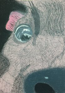 I worked on the ear and the nose a lot, and finished adding all of the gray to the page. The highlights were added for the nose and the ear. 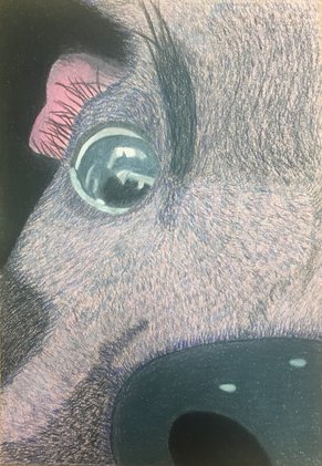 Lastly I added some blue and violet shades to get value changes. I wanted there to be more blue in the piece than violet. I left a little bit of the pink paper showing through just to add a little more color to the piece. SELF EVALUATION
1. Describe the craftsmanship of your drawing. (Is it neat and well executed?) I think that I did a good job of keeping my piece neat and drawing the fur carefully. It was time consuming to draw all the individual hairs, but it was worth it to make the piece look like it had more texture. Also all of the layering on the eye took a long time, and I think it turned out really good in the end. 2. Do you think you used a full range of values to create the illusion of depth? My range of values in the fur help to show how close or far away different parts of her face are. The nose and the eye don't have much depth to them, but the ear and the rest of the fur have a lot of value changes throughout. 3. How do you think you represented the style of the artist Georgia O'Keeffe? I represented her style because the picture is very up close, but the subject of my piece is different from what she typically created. She typically did flowers and landscapes up close, while I decided to do a dog, but the upclose style is still the same. 4. Describe your choice of colors/color harmonies and how you used them throughout the artwork. The reference picture that I used was very dark with lots of black and gray. To add more color to my piece I used a colored paper and added some blue and purple to the piece. The blue, pink, and purple all go very well with the original color scheme of the dog and the three colors can be seen throughout my piece. 5. How did you create contrast in your drawing? Using different shades of blue and violet to create different values in the fur created contrast in my drawing. Also the different textures between the fur, nose, and eye showed a different contrast in texture. 6. How did you use textures, highlights, and shadows to enhance your artwork? Texture was a very important part of this piece because without it the fur wouldn't look nearly as realistic as it does. One place where I really utilized highlights and shadows was the eye. There was a reflection of part of a room within the eye, and through highlights and shadows I was able to show the change in value within that reflection. 7.Describe any difficulties you had creating your drawing and what you could do to improve your drawing? I had some difficulty with figuring out how much blue to add and what shade to put where. I also struggled some with changing the direction of the fur in different areas of the face. Part of my reference photo was a little blurry, so I couldn't tell exactly what way the fur was going. To improve I could have found a higher quality picture of that part of her face just to look at the fur in that specific area.
0 Comments
Leave a Reply. |
AuthorThis blog has my work for every art class I have ever taken in high school. You can find my work from Art 2 and Computer Art actually on here, but my work from Art 1 and Sculpture is on a link to a separate page. Archives
May 2017
Categories |
 RSS Feed
