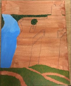
 At this point I had done the wash layer on my canvas, and started to paint the river, the trees, and the grass. 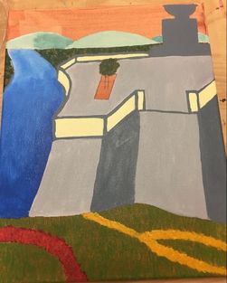 I painted all the gray stone, the statue, the mountains, the flowers, and added more value to the river. 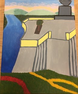 I added the steps, worked on the tree in the middle, and started to work on the sky. 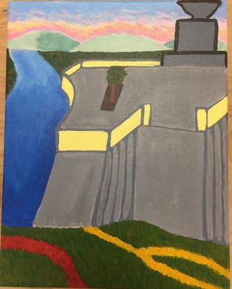 This is the final piece. I darkened the sky and the stone, and fixed the outline on the statue. 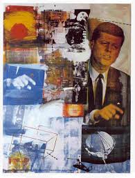 This is one of Robert Rauschenberg's paintings. Retroactive I Self Evaluation
1. Who was your referenced artist for the painting? Name 4 main ideas you used from your research to create your painting. Robert Rauschenberg 1. I used his collage style by pulling in pieces from multiple pictures when creating my landscape. 2. I tried to use some spontaneous brush strokes that looked thrown in like he did with his own style for areas like the steps. 3. Pop Art involves demonstrating that everything is connected, so I tried to make the pieces from the different pictures appear connected. 4. His monochrome paintings started off in black, white, gold, and red, so I tried to make sure that these colors were used throughout my piece (even though it wasn't monochrome). 2. Describe the craftsmanship of your painting. (Is it neat and well executed?) Certain parts of my painting have better craftsmanship, while certain parts look a little sloppy to me. I think that the river and the sky show good craftsmanship because of all the different colors and values that are scattered throughout them. The statue and the stone aren't quite as good, but I think that they are still pretty good. 3. What was the most difficult part of this project? The most difficult part was trying to proportion everything when I was sketching it onto the canvas. Once I actually started painting the picture it wasn't too bad, but trying to make everything fit on the canvas nicely when they don't all come from the same picture was a little difficult. It took a lot of erasing, but in the end I think I got things proportioned pretty well. 4. Describe your color choices and how they reflect the work of your chosen artist. He used lots of primary colors in his work, and I have lots of primary colors in my piece with the river and the flowers. He also uses black and white, and some values in between, which can be seen with the stone and the statue in my piece. 5. Describe how the style of your landscape reflects your chosen artist. The style of my landscape reflects his work because I took pieces of landscapes from a bunch of different pictures to try to emulate his collage style. It isn't quite as obvious in my piece that it isn't an actual landscape, but I used pieces from almost all of my reference pictures in the final piece. 6. What do you think your chosen artist would say if he or she could see your painting today? I think he would suggest using mediums other than just paint to add to my piece. There is nothing sticking out from the painting, which is something he commonly did. He might also suggest making the painting more sectioned off for the pieces that are from different pictures, and to make each section be one color (he tended to do this in his collage style). Basically, I think he would make suggestions to me to make my painting more like his style. 7. What would you do differently if you were to do this project again? I would try to make it more obvious that it isn't supposed to be an actual landscape. It would look more like his style if it had the collage look to it a little more. Also I would try to make the steps look a little more like steps, and maybe make the whole stone area smaller so that it doesn't take up as much of the canvas.
0 Comments
Leave a Reply. |
AuthorThis blog has my work for every art class I have ever taken in high school. You can find my work from Art 2 and Computer Art actually on here, but my work from Art 1 and Sculpture is on a link to a separate page. Archives
May 2017
Categories |
 RSS Feed
